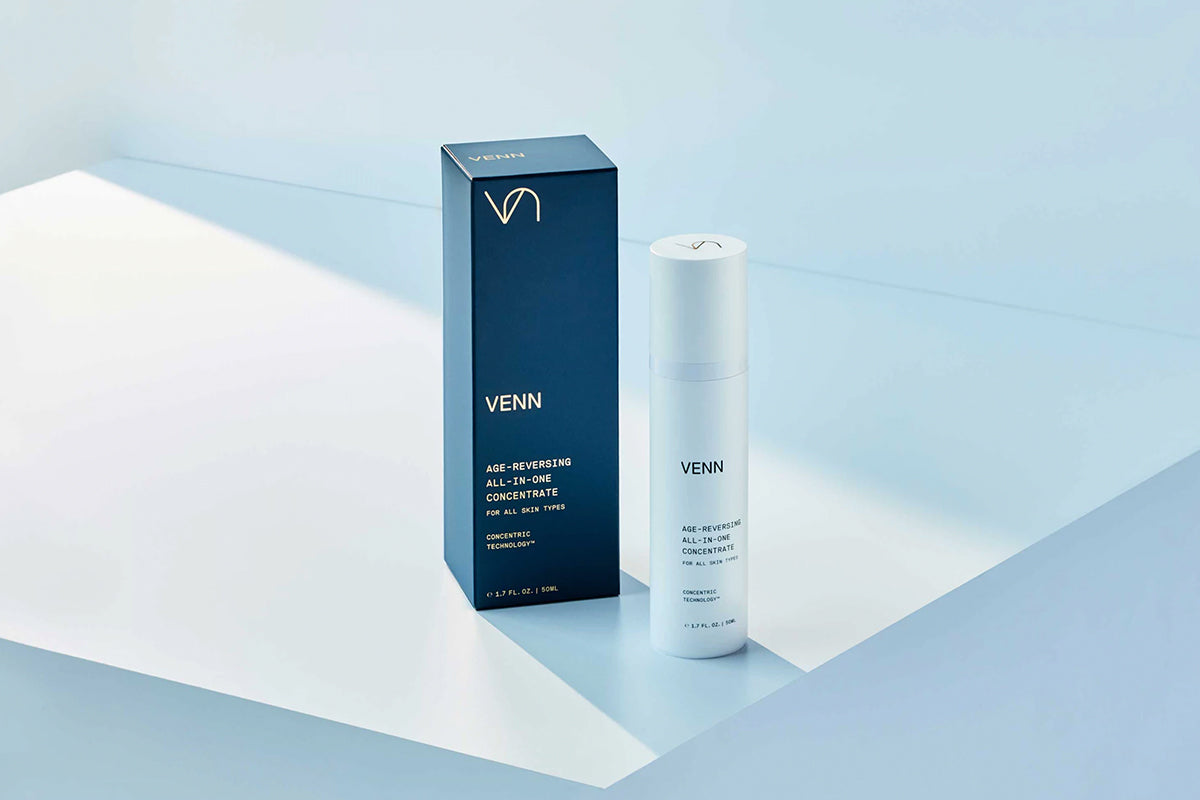
Branding for the Science-Based Skincare Line Highlights the Technology Behind the Product
VENN is a revolutionary all-in-one skincare concentrate that is clinically proven to reduce signs of aging. Pentagram has developed the branding for the science-based skincare line, including naming for the product and the technology behind it, brand strategy, positioning and messaging, and visual identity, packaging and website.
A true innovation in its category, VENN offers a comprehensive, timesaving antidote to the conventional, labor-intensive skincare regimen. Made of nontoxic ingredients, the anti-aging concentrate combines the multiple steps that typically involve numerous products––each with its own stated purpose and unsubstantiated claims—into a streamlined process. Its advanced technology penetrates skin more effectively, and ensures the key ingredients are immediately absorbed and delivered to each layer, maximizing their positive effects.
Pentagram developed a brand strategy that focuses on the science behind the product, without making it too technical. Working closely with VENN founder Brian Oh, the designers created the concept of “warm science” as the foundation of the rational, evidence-based skincare brand. Warm science encompasses the product’s seeming contradictions––it’s efficient and practical, yet premium and luxurious; it’s made of natural key ingredients, yet technologically advanced––signaling VENN’s disruptive approach and setting it apart from other brands in the field.
The warm science concept is captured in the name, which is inspired by a Venn diagram and its overlapping concentration of elements. The name reflects the product’s intersection of science and nature, its many benefits distilled into a single formulation, and the potency of the combination. Unlike other skincare brands, “VENN” avoids literal references to science, like labs or numbers, and poetic metaphors for beauty and romance. At the same time, it evokes reason and logic, engineering and precision, but is simple, accessible, and easy to remember.
The logo for VENN layers the “V” and the “N,” forming a Venn diagram that visually echoes the name and conveys the integrative qualities of the product, as well as its role as a shortcut and all-in-one that is more than the sum of its parts. The look and feel of the identity is elegantly minimal, conveying efficiency and efficacy. Typography is set in the contemporary sans serif Replica Mono, which features precise, geometric letterforms that are soft and approachable.
Pentagram also developed the name “Concentric Technology” for the proprietary technology behind VENN. The name evokes the idea of concentric circles, or circles within circles, that depicts how the product functions, implying depth, dissolution and continuous action. The phrase serves as a close conceptual counterpart to VENN and captures the multiple functionalities of the product and how they work together. The team also coined names for the three components of VENN’s science: Delivery Technology, Solubilization Technology and Hydration Technology.
Throughout the branding, a friendly, relatable tone of voice expresses the idea of warm science in language that is smart, honest and inviting. Pentagram designed and produced a brand video that distills VENN’s complex innovation into an elegant one-minute animation. The sequence traces the product’s processes through simple geometry and line drawings that illustrate how it works in a way that is easily understood.
VENN is packaged in a sleek, functional cylinder that is both implement and container. A color palette of deep green and white references nature and science. Inspiring imagery by photographers Gentl and Hyers captures all aspects of the brand, from product to ingredients.
Read full story here.


